


Table of contents

No headings in the article.
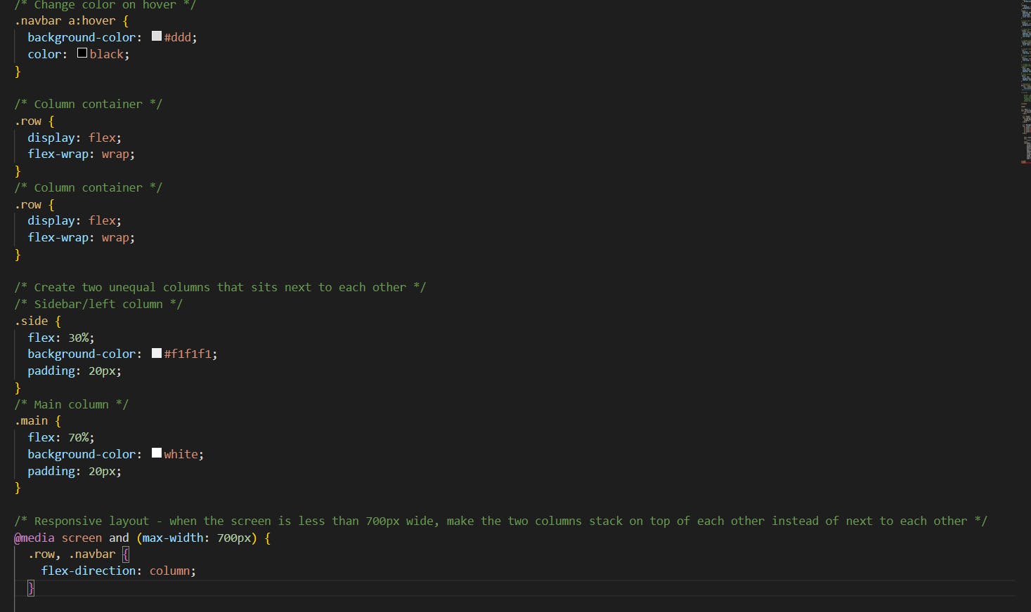
🤔What is media query in CSS?
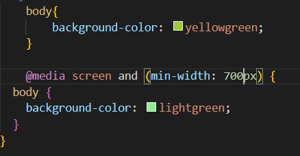
Media query is very useful to organize our content in a given limited window size..... Moreover, we can set the background color and any other CSS as well. For example, if we set the window screen to 700pixcel and up so background Color will be pink otherwise less than 700pixcel so the background Color will be yellow-green.
In addition to that, we can set it according to the window size, tablet size, mobile size, and so on...
Let's see practically how it will happen...…
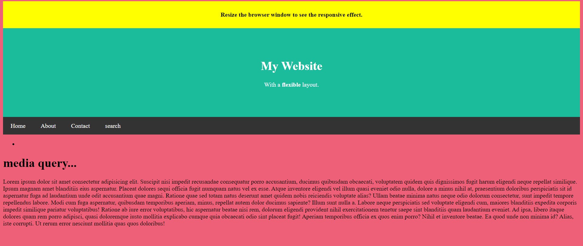
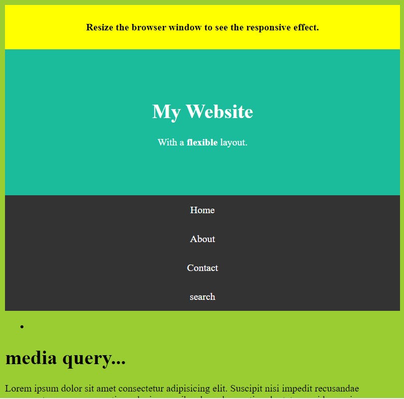
Output:
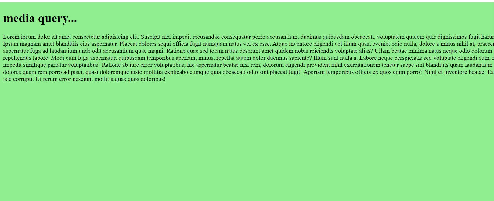
In the above image, we can see I put a condition in CSS that if my screen size is less than 600 pixels so it has yellow-green Color otherwise light-green.
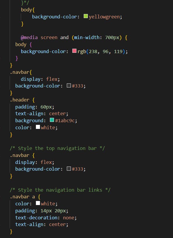
In this example, we can see observation when my website is on the normal screen so all nav bar links are in a row but when I turn the big screen into the small screen so all navbar links are converted from the row into a column
Output:
To conclude, Using this media query we can give CSS and we can get our content in all kinds of devices according to their size...